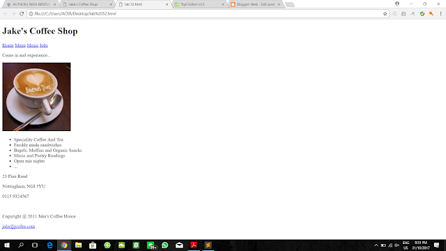
Lab- (Critique of web design)
1. Is
the page appealing or unappealing ? Give your justifications.
- The design of the prototype 1 is more appealing than prototype 2.
- The design of prototype 1 contain 2 to 3 primary colours that blend well and create a proper mood or tone for business and the blend well colour also grains the attention from audience to focus on the main point for the page.
- The suitable colours combination for the text and background and the suitable fonts that used in prototype 1 make the content more clear and the user can easily read through the page.
- Graphics are important, as they lend visual variety and appeal to an otherwise boring page of text. The used of graphics in prototype 1 is more interest than prototype 2.
- A simple way to increase visual appeal is to use high quality photography. High quality product images are especially important for online retailers. The higher quality photography that prototype 1 used increase the visual appeal from the audiences and make audience want to browse more product in the website.
2.
Is the page appealing or unappealing ? Give your justifications.
- I would like to improve an unappealing website by developing some types of visual content into website like photos, videos and infographic which is relavant in websites. It will quickly catch the attention of users compare to a blocky chunk of text because human’s brains transmit visual data far faster than text.
- Besides, a website that contain a large block of content will make users unappealing and it is hard for users to identify the important elements and key facts inside the article. Like example, using bullet points will make content more clearly and easily for users to digest. Keywords need to highlight by using Bold, italic and underline style. Headings also needed in content since it is not only to break up the content but to tell users what sections are about.
- Another way is strive for consistency in design, layout, site navigation and colour. Use maximum three or four colours can simplify a website and make the layout more visually appealing. A cleanly website will make users feel comfortable and appealing compare to a colourful and chaos website.
3.
Would you encourage others to visit this site ? Why or why not ?
-
I will encourage others to visit prototype 1 because it has a consistency design. Consistent design always allow users to focus on the message. Consistent not only contribute to a good looking design but it will also provide a familiar experience for users. Elements like footer, sidebar and navigation also provided for users to get used to the location of these elements. Most important is, there is a search engine optimization in website that can improve users’s experience and usability of websites by searching anything they would like to know.
4. Then, compare these two designs with the
latest web design of WeighMax. Search this website. What do you
think?
- The design of the latest web design of WeighMax has improve to a higher level.
- The background colour of the website used is white colour, it avoid the customer attention being disturbed and can focus on the main point, they used red colour to point out those important point that The WeighMax want their customer look for.
- The colour and fonts that the webpage used is also suitable that make the customer easy to read
- The latest website also clearly label the topics and break the text up into small paragraphs and all the content are relevant to the product. It will never bore those visitors with visually overwhelming text and can grab their attention by being clear, concise and compelling
- The latest website also provide the online customer service that allow the customer directly communicate with the customer service immediately and can solve their problem immediately. It is a very good service to the customer
- The graphic and the animation that used in the latest website also is an improve to the website, it grains the customer attention while watching the animation of the pictures and the animation also make the customer focus on it and let the customer know about the product that the WeighMax want to promote.
- As a conclusion, the latest design of WeighMax website is the best among these 3 prototype design.


Comments
Post a Comment